Before & After: Our Living Room Reveal Full Of Creative Design Tricks
When we bought our condo, I saw immense potential oozing from every corner. The apartment was beautiful to begin with, but you could only describe it’s “aesthetic” as “basic builder”. It was neglected from any real design love, not to mention all the odd furniture we inherited from the previous owner. So much beige. So much pleather. Despite its stunning bones, hardwood floors, the tall ceilings, the wrought iron balcony, it seemed to have been stripped on any personality. So I made it my mission to bring it back to life.
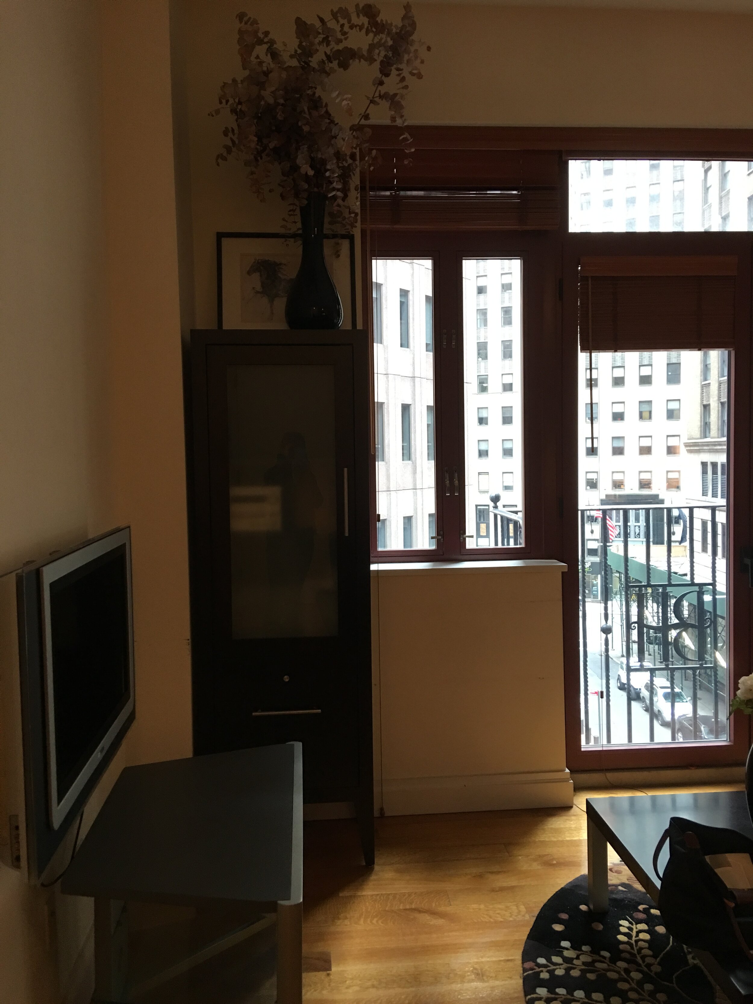
Just look at this before. Burgundy windows. Weird yellow lighting, weird layout. So much beige. SO MUCH BLACK PLEATHER. But, like, why tho?
The BEFORE:
Dated & Cramped


The AFTER:
Bright, Modern, & Inviting

Can you even believe it’s the same space?! Let’s break it down:
The Fix:
Furniture That Complements
Here’s a quick lesson about understanding furniture’s role in design:
Step #1 was to get rid of the just-plain-wrong-for-the-space furniture. If you notice, the previous owner had a lot of black furniture. Two black couches (I still can’t get over the pleather), a black coffee table, two black bar stools, a black high table, and a black bookshelf. Now, we’ll talk why matchy-matchy furniture is such a faux pas in a future post, but I will mention this: Not only did the combined darkness of those pieces create visual darkness, the fact that these pieces were all quite chunky just cluttered the space and made it feel smaller than it was. In my experience, most people buy furniture that is too large for their space and yet, they also tend to buy rugs that are too small, both evident in the previous owners choices.
So the first thing we did was sell the old furniture (try not to just throw things away!). Immediately, the space felt bigger, cleaner, and more calm. To soften the somewhat cherry/orange colored floors, I brought in a light colored rug that would visually bounce light off itself (like white sand on a beach) and bring more light into the room. I chose this mid century velvet blue couch to anchor the room and create some visual interest so things didn’t feel too bland, while the low and spindly reading chair and marble coffee table offset the couch's darkness by their light and weightlessness. This marble table was actually our second coffee table purchase. Prior to this one, I mistakenly bought a rectangular coffee table that turned out to be way too big for our space and ended up selling it on craigslist. Proof that it’s okay if you don’t get it right the first time!
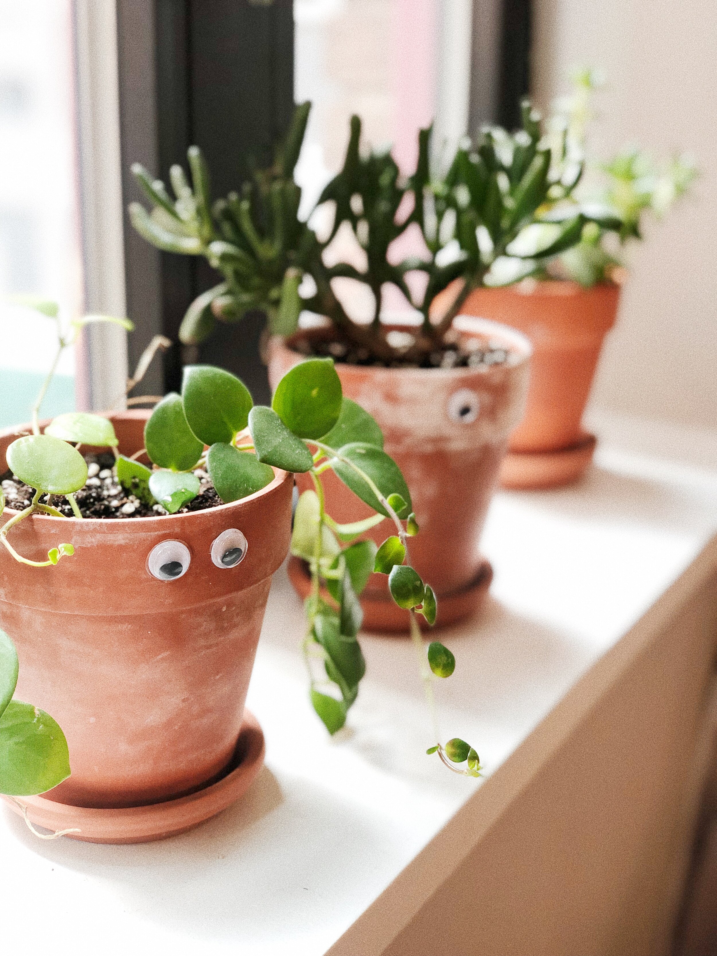
Then I added soft touches like the sheepskin (purchased in Scotland) and mud cloth pillows (a flea market find in LA) which added softness. The floating shelves kept any clutter out of sight and the bronze touches added an air of polish without overwhelm. Also, when in doubt, add a plant! (my favorite is the Golden Pothos or thick leaf succulents - they are available everywhere and super easy to keep alive).


The Fix:
Upgrading The Window Frames
“Good light” is one of the most important features of a home and the window frames are what bring attention to it. They are like eyeliner on a beautiful eye, helping draw your attention to the view and the source of light. Too bad ours were dated and….burgundy. So we decided to give the windows a modern black frame.
The first thing that got me excited about the apartment when we first saw it was the windows in the living room and french doors that opened onto the balcony. It was my NYC dream, minus the weird burgundy color that was killing my modern vibe. So I took a huge chance (after much research) and decided to spray paint the window frames a hammered black. (I think I just heard some people gasp from across the internet!) I have much more to say on this entire process in a future post, but so far it’s been 3 years and it’s held up!
This is the before and roughly what the process looked like:

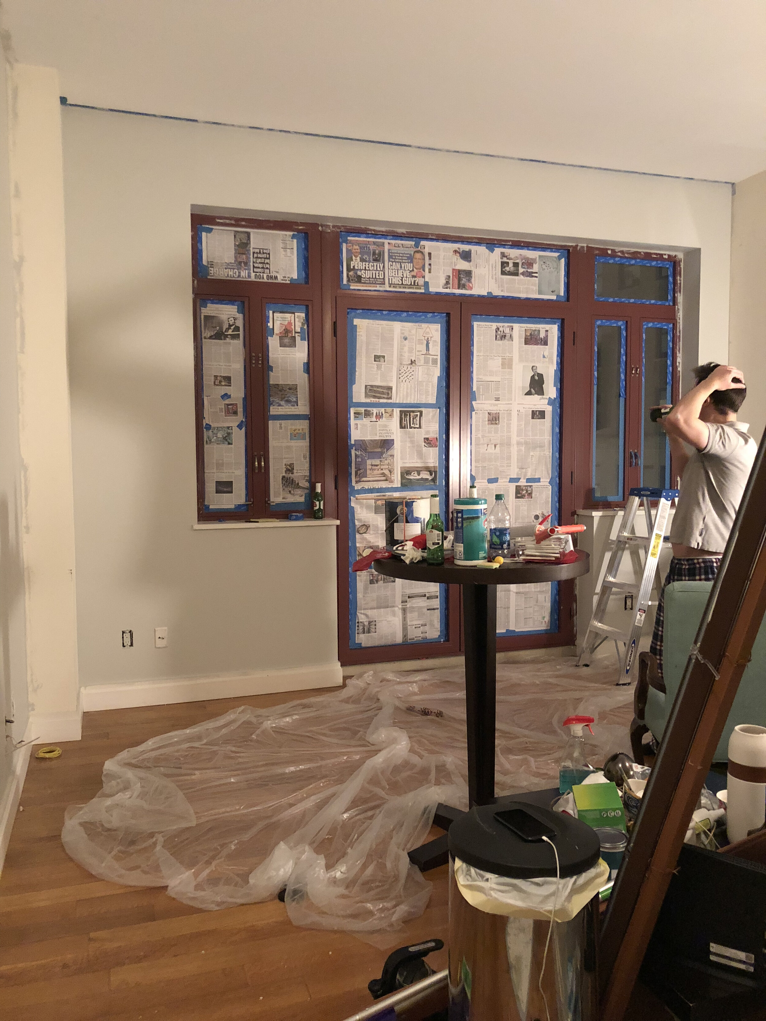
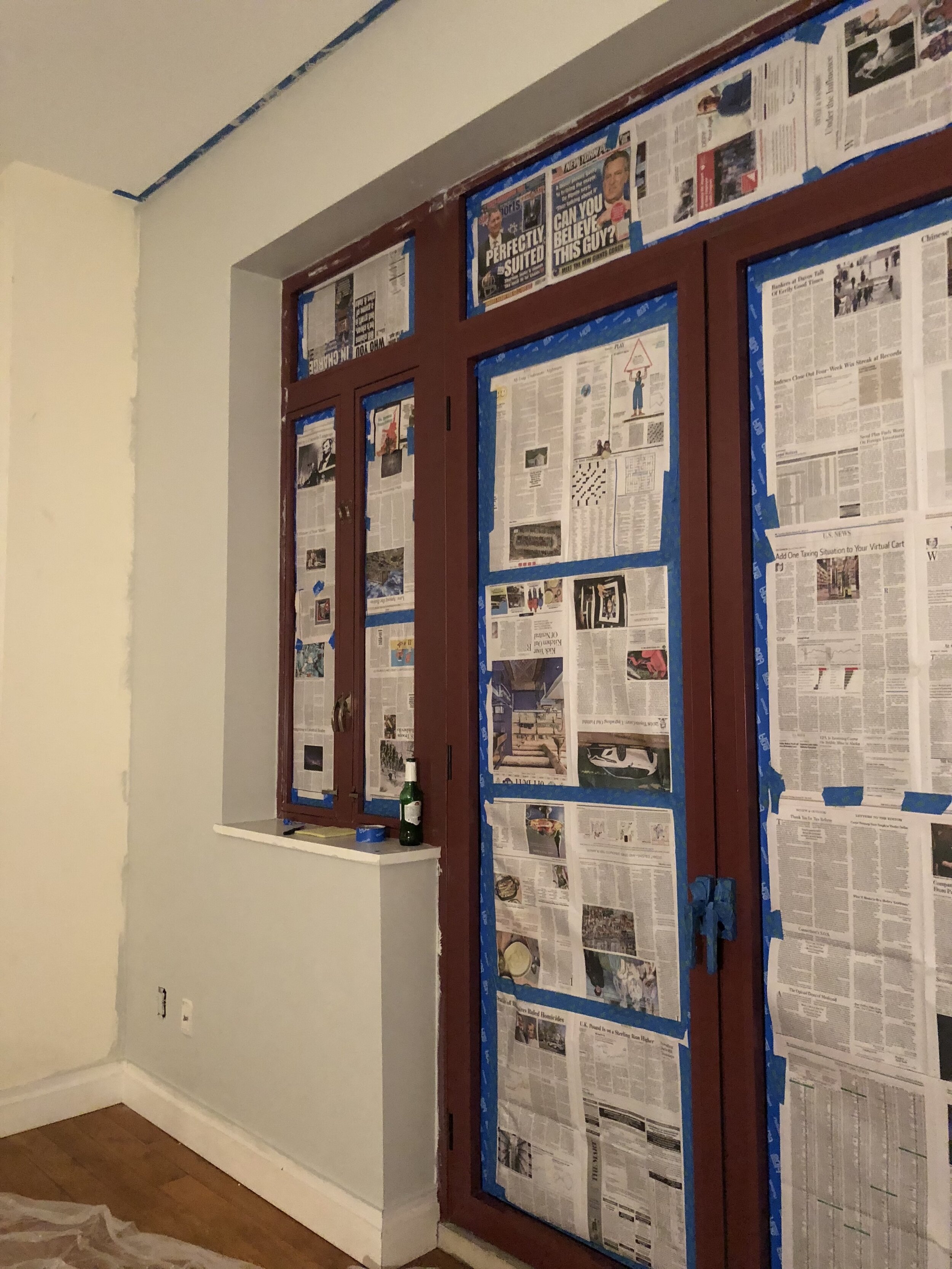
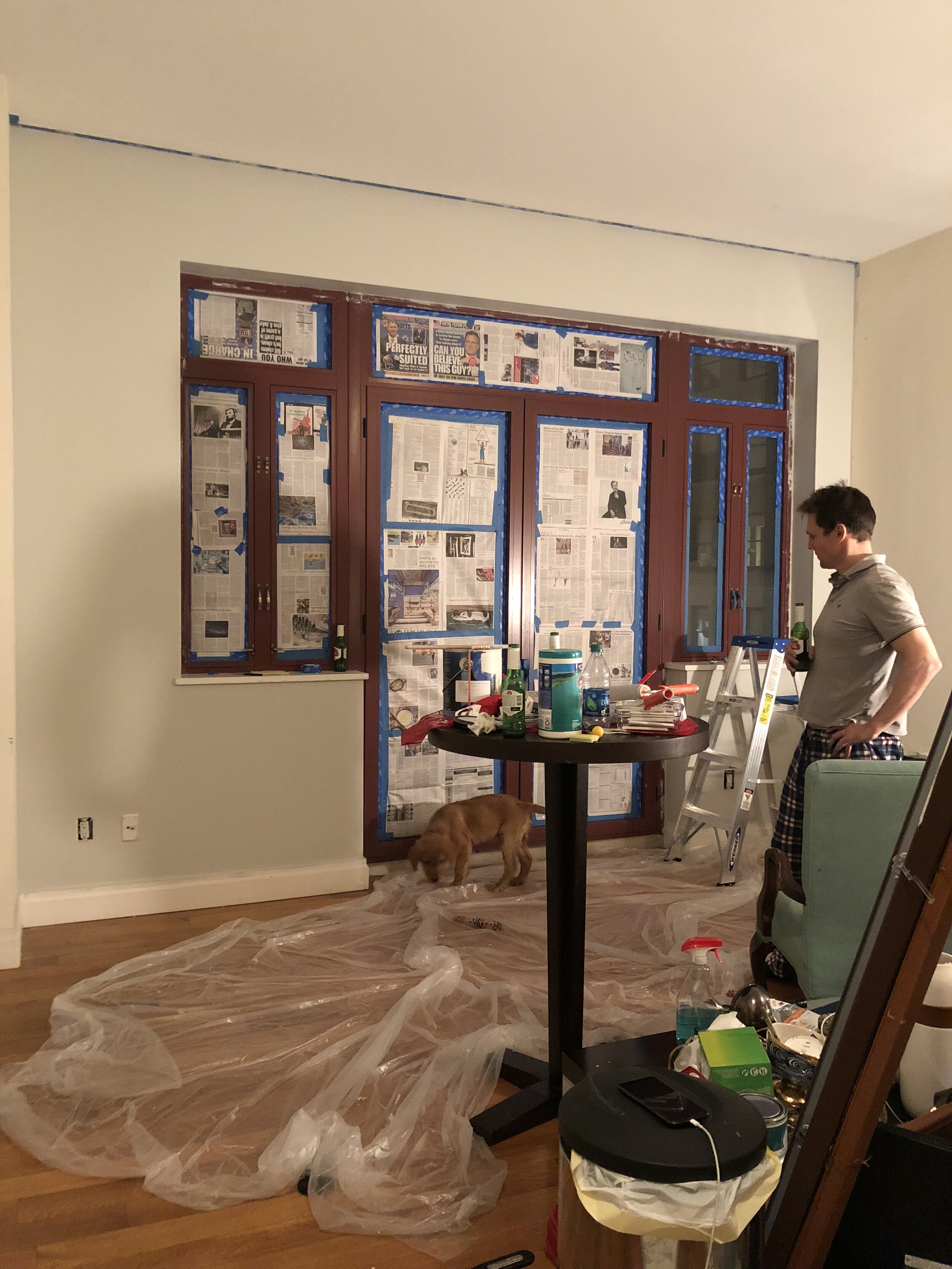

It involved a LOT of taping, a very steady hand, and lots of carefully applied layers of very thin spray over hours and hours.
The process took forever to finish but was so worth it in my opinion. I couldn’t be more pleased with the “After”.


The Fix:
Visually Doubling The Space With Vertical Mirrors
Aaaaah, the oldest trick in the book: mirrors. This one’s an oldie but a goodie, and boy does it work! We purchased these 3 oversized mirrors above the couch from IKEA and decided to hang them vertically, so that your eye is drawn upwards towards the tall ceilings. Notice how their reflection makes it feel like the windows and the french doors are double the size, almost like the room is twice as wide. Bang for buck, I think this has been the greatest single transformative trick.

Our “in-between” living room with a flat wall and our first coffee table, which I later sold because it proved to be too large for the space.

Our living room today, with the black window frames being reflected in the mirrors, continuing the eye line to visually extend the space.
The Fix:
From Dead Space To Feature Wall
You may have seen this story on my IG. I like to think of this as a modern ugly duckling story. In the before (below) you’ll notice this bookshelf space used to be an awkward nothing wall that the previous owner just pushed a couch up against, presumably to downplay it. I don’t know, but it clearly wasn’t working. So I decided instead of trying to blend it in, I needed to make it stand out and give it a purpose. Now instead of a forgotten afterthought, it’s an art display case, bookshelf, and bar cart all in one, and one of my favorite features of our living room. Today’s lesson is this: if something feels like the ugly duckling, make it a swan. 🦢 (bookshelf is @cb2 and wall color is Hale Navy by @benjaminmoore) #modernbookshelf


The Fix:
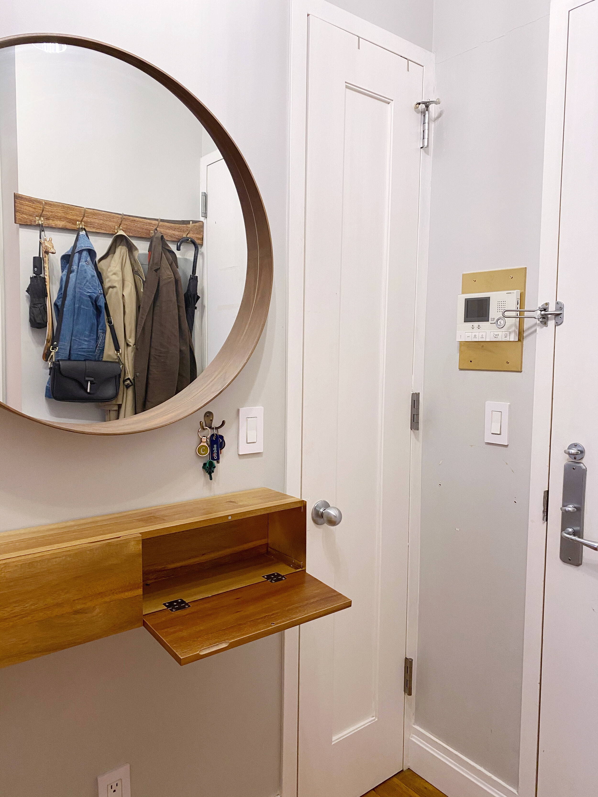
Creating A Functional Foyer
If you’re a New Yorker, you know that if you’re lucky enough to even have a “foyer”, it’s probably pretty tight. We had roughly 3 feet of wall space to play with but also wanted to avoid any clutter. Here’s the sad before:

The Before
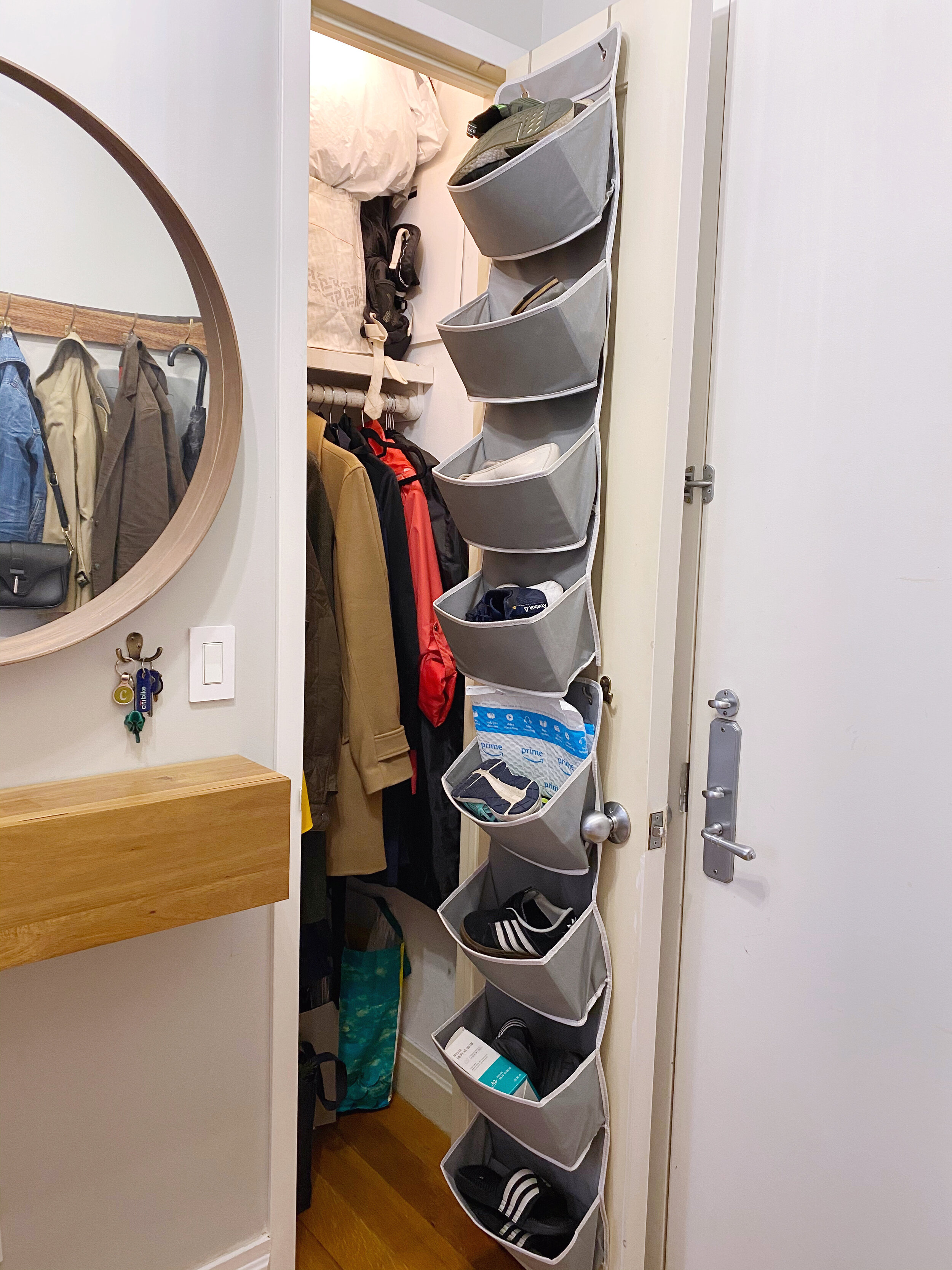
We wanted our entry way to be free of clutter and a calm place to greet the house when we came back from work, not a dumping ground for stuff to gather, so we intentionally didn’t install any storage on the floor (no shoe racks, no seating benches). Instead, we fell in love with and installed this floating shelf that’s got tiny hidden drawers in it from CB2, and added a simple hook for our keys and a circular window with a ledge for any small items like sunglasses. The inside wall of the small closet is where we keep our hall shoes and coats. (I must admit, it’s pretty stuffed in there, but I would rather it be hidden because I like to think of myself as an aspiring minimalist!). On the opposite wall, a live edge board with hooks gives us a nice place to hang our more everyday items (so we can avoid fighting with the winter coats in the closet on a hot summer day)

Originally, (and in the photo above) the intercom system panel above the light switch had a dated plastic white backboard, and because of all the wiring involved, it seemed like too much of a hassle to switch it out. So instead, we chose to just upcycle it with some spray paint:

That’s Part 1, done! Stay tuned for the bedroom reveal. In the meantime, here’s a (almost) complete resources list for all the styling elements that are used in the after. Let me know if you guys want to know about something in particular.
The Styling Resources List:
Velvet Couch - The Sven Sectional from Article in Cascadia Blue
Marble Coffee Table - Also from Article
Vintage Brass Tray on Coffee table - a Los Angeles Flea Market Find (I’m a bit of a hoarder of vintage trays)
Chair - The Esters Chair from Target
Brass Library Lamp
Rug - A Wayfair find!
CB2 Floating Storage Shelves - We love these so much we have 3 of them dotted about.
Curtain rod - CB2
Curtains - An amazon purchase
Vase + stems - World Market and Magnolia
Mudcloth Pillows - a Los Angeles Flea Market Find
Mirrors - Ikea